Roles: interface design, information architecture, wireframing
view Cardstore.com

The following images were part of a preliminary presentation to key stakeholders (including brand, user experience, technology, and operations) for navigation, messaging, and layout considerations.
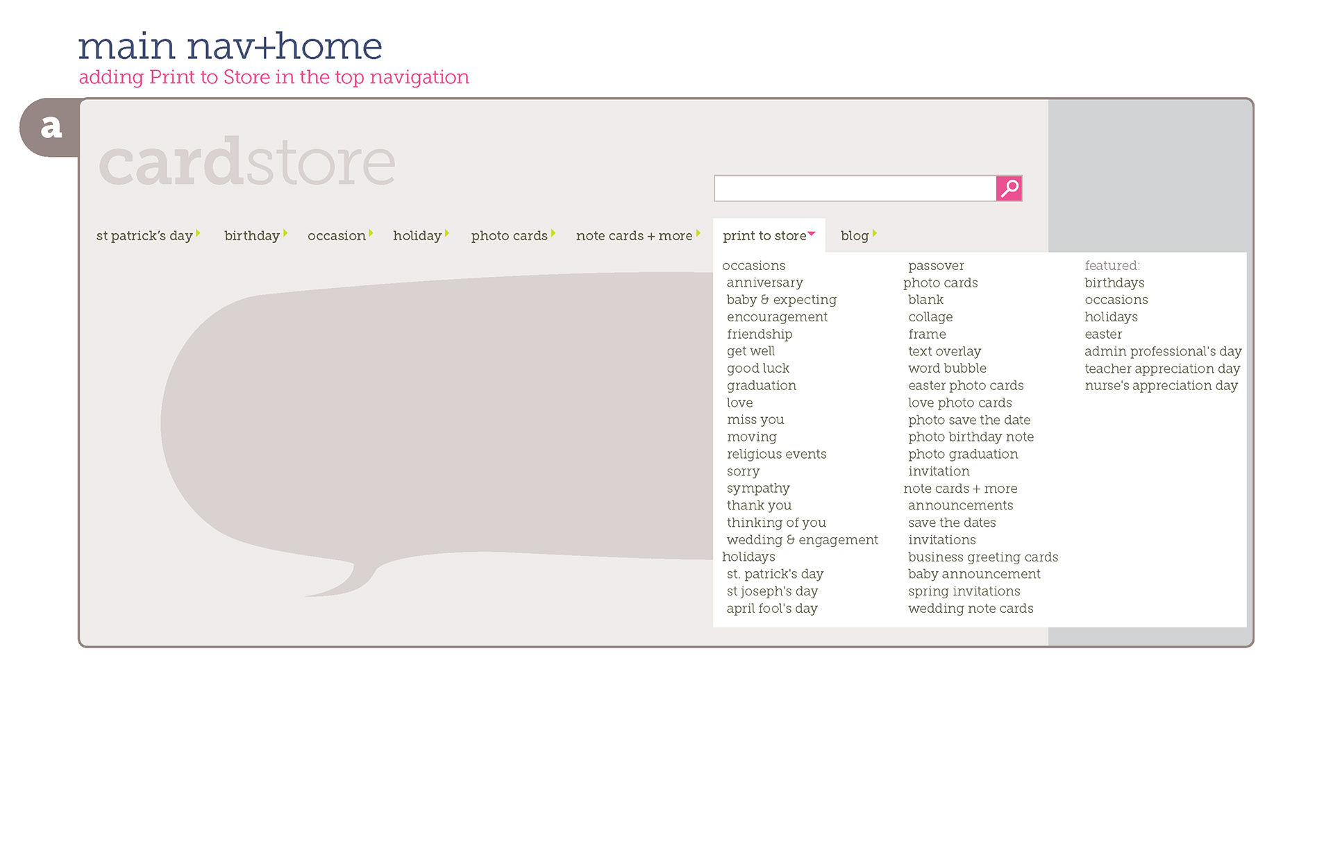
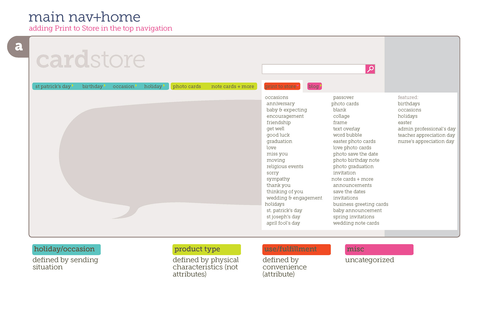
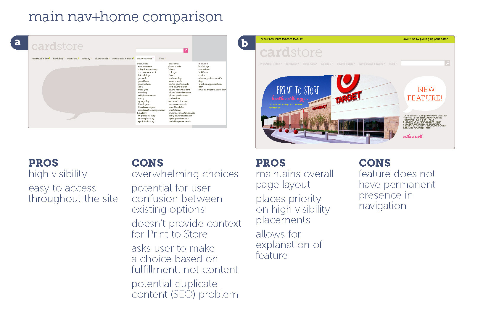
Our first idea was to add a new tab to the main navigation to optimize the new feature's visibility.
We decided against adding a new tab because it did not allow space for an explanation of Print to Store.
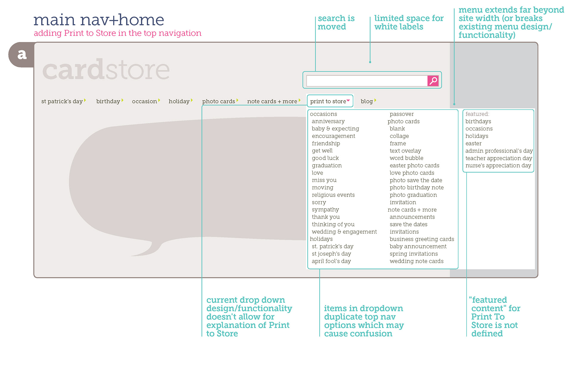
Adding a tab was also introducing a new category to the navigation, which would cause confusion for the user.
By maintaining the existing navigation, we were able to feature Print to Store in the Hat and describe it on the homepage.

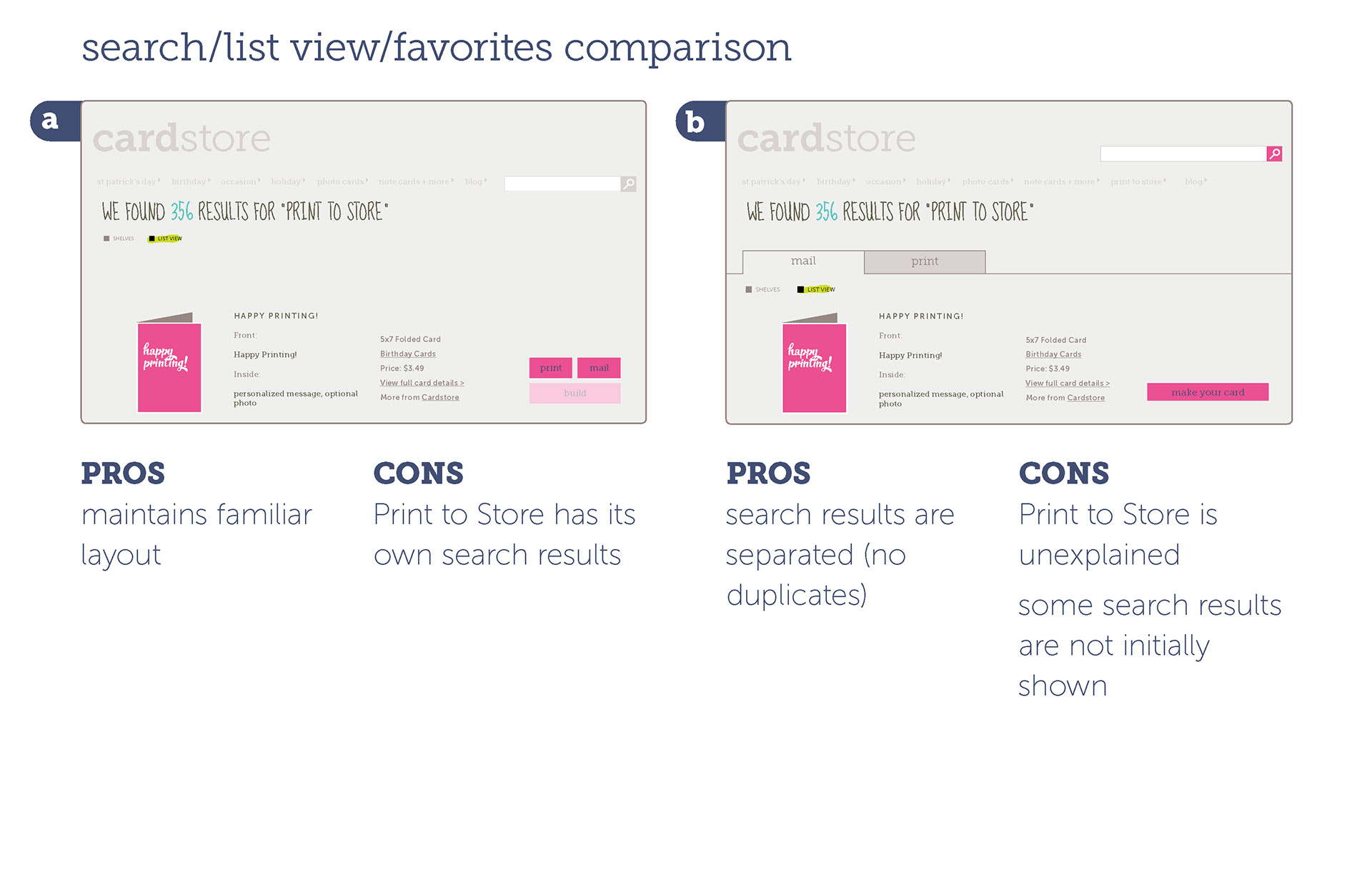
We made our decision by comparing the pros and cons of each option and testing .
On the Product Page, our first idea was to create a button configuration which would also be used in the List View.
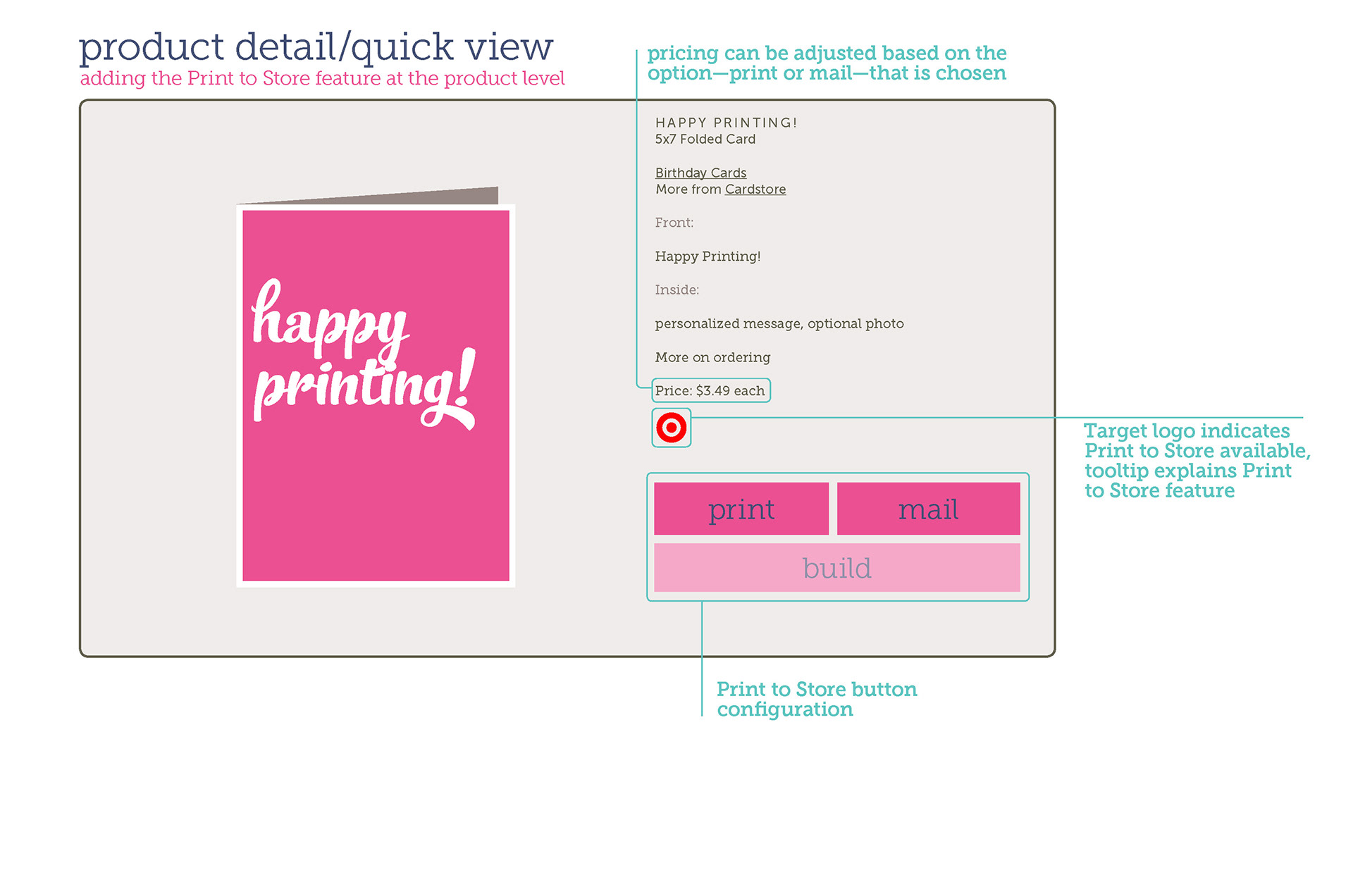
Due to familiarity, radio buttons were used in the final layout.


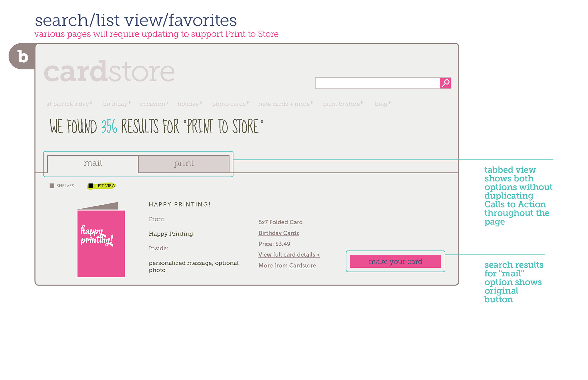
We also considered a tabbed view to address the issue of redundant UI.
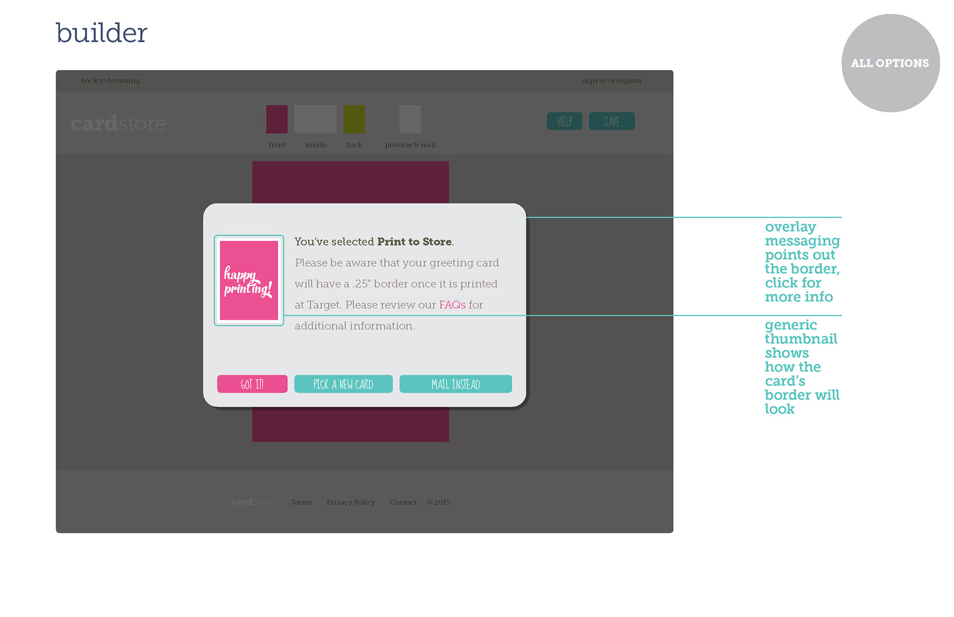
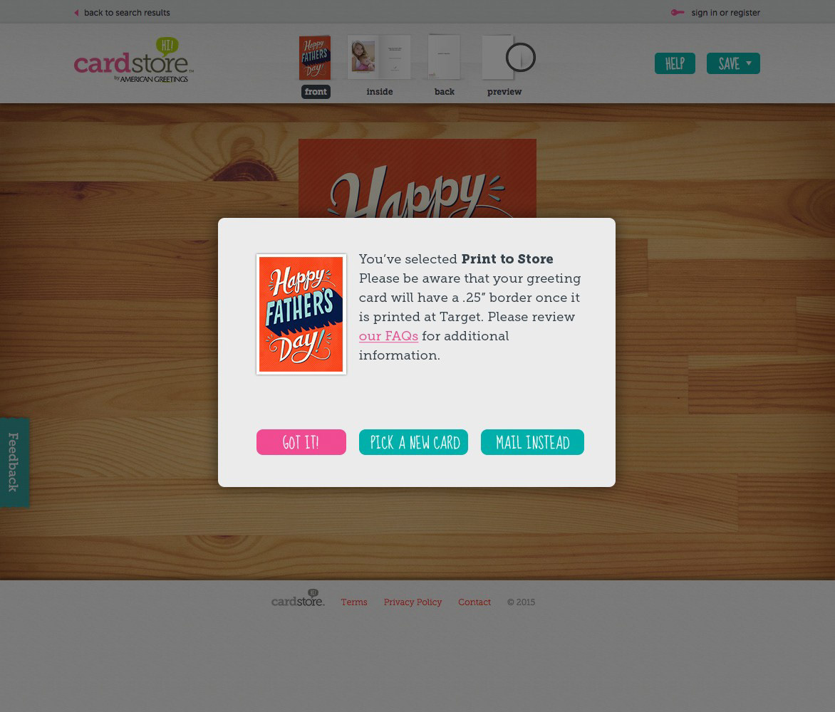
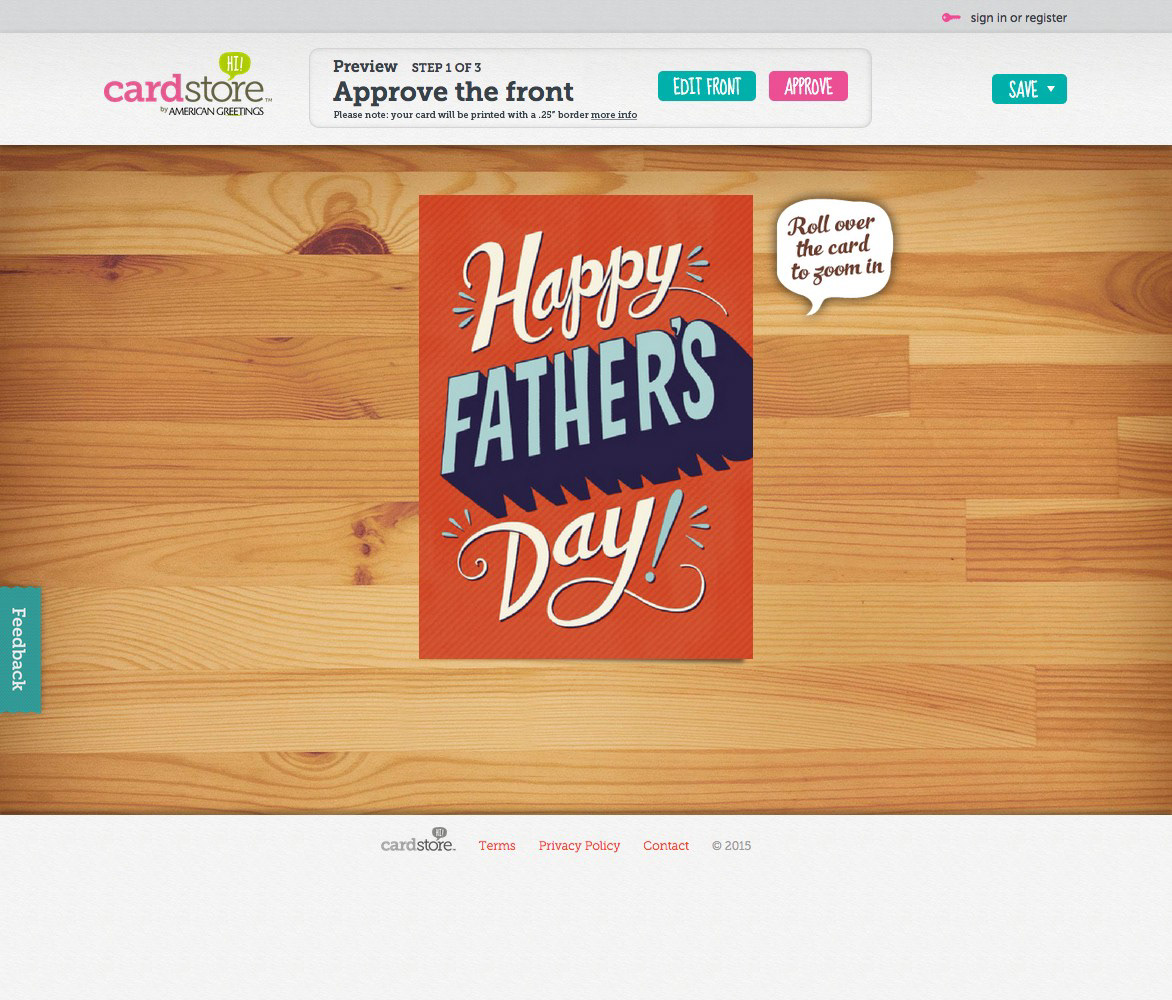
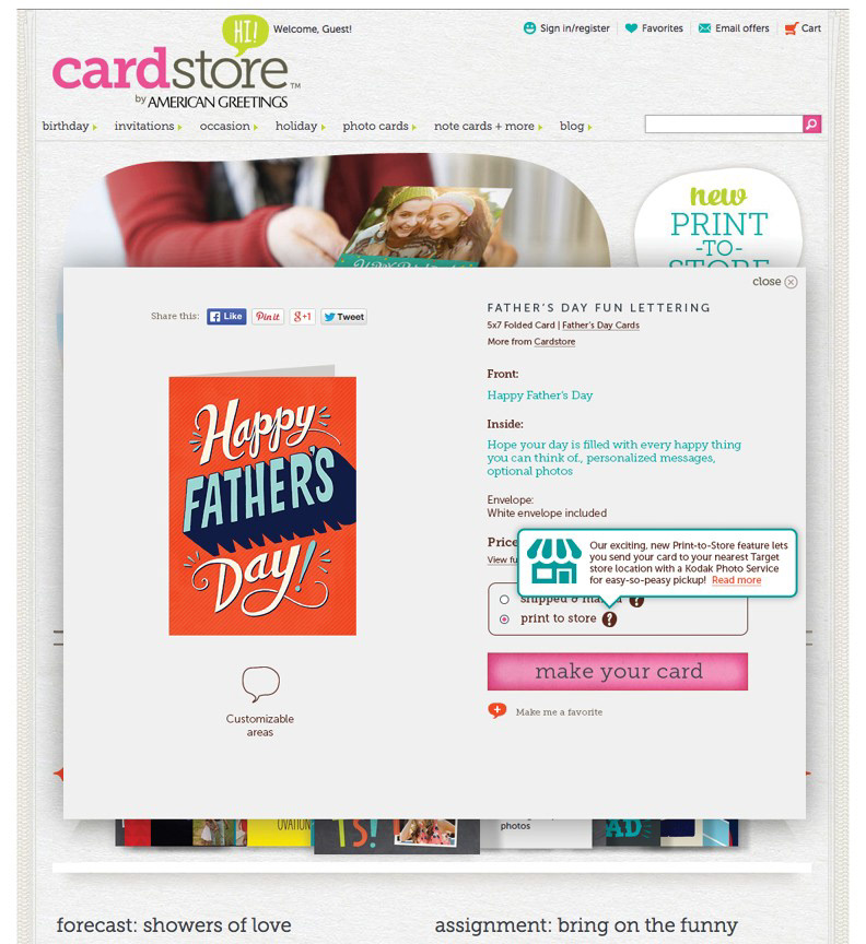
Once a card was selected, the user needs to be messaged about the .25" border (due to technical limitations).